

KNOWNSOURCE
A curated second-hand fashion marketplace catering to those who value unique and sustainable style, featuring quality clothing from independent businesses
Summary
Boost User Engagement and Enhance Brand Discovery on the E-commerce Platform
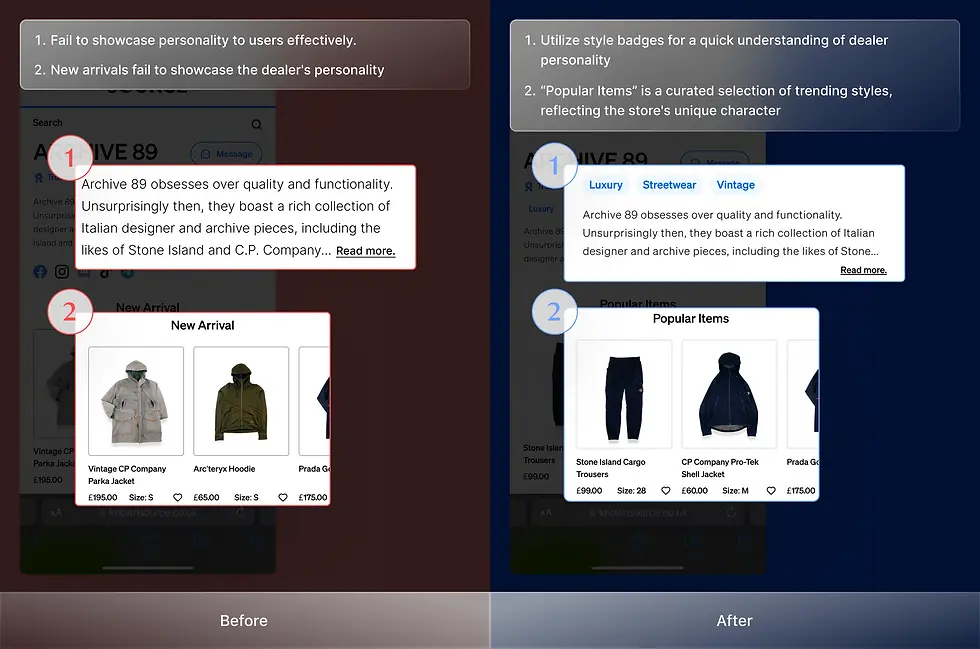
01. The new design for dealer storefront pages solves connection issues, boosts engagement, and earns positive feedback
Challenge: Users struggled to connect with dealers due to the original design failing to effectively showcase dealer information, reducing user engagement and conversion rates.
Result: The new design highlights dealer personalities with simple visuals, significantly improving user engagement. Users found it efficient for understanding dealers and expressed a desire to stay on the platform longer, while stakeholders confirmed its success and began implementing it after interviews.
02. The optimized brand page, with organized data and refined filters, resolved discovery issues, reducing frustration and cutting time on task by 13 seconds (56%)
Challenge: Users struggle to discover new brands on the brand page due to its unclear structure, leading to frustration and inefficient exploratory.
Result: The optimized brand page, featuring organized data and refined filters, significantly enhanced usability by improving brand discovery and reducing the time on task by 13 seconds (56%).
My Role
Product Designer
Project
Team Project
Timeline
Completed in 6 weeks (2024)
Platform
Mobile & Desktop Web (RWD)
Reflection
01. Work with design peers
Develop designs by gathering ideas and research insights through multiple group brainstorming sessions and discussions.
Challenge: We faced numerous ideas from different designers, making it challenging to choose without disappointing someone.
Solution: I created a harmonious environment to discuss and explain the reasons behind each design choice. By extracting and integrating elements from various designs, we collaboratively refined them into a final version.
02. Design within existing frameworks
Create “ new designs “ within existing frameworks and utilize the current design system for user interface design.
Challenge: Stakeholders wanted a fresh look for the redesigns while maintaining the KNOWNSOURCE personality and the existing design aesthetic.
Solution: Before starting the design, we familiarized ourselves with the design system and existing elements to minimize introducing new components. This approach allowed us to utilize the existing framework to create a fresh look.
03. Balance stakeholder and user feedback
Finding the sweet spot between conflicting user feedback and stakeholders' perspectives is critical for success.
Challenge: We put users first, collecting their feedback extensively. However, after discussions with stakeholders, they provided a business perspective that sometimes conflicted with user needs.
Solution: I reviewed the users' needs again and conducted a competitor audit to identify alternative design strategies. I found a sweet spot between users' needs and stakeholders' perspectives, designing to satisfy both parties.
Results
Reduced time on task by 13 seconds (56%) and received strong positive user feedback, leading stakeholders to implement the new designs on existing pages
We conducted user testing with 8 participants, followed by an SUS questionnaire. We tailored tasks and timed their completion, observing their interactions to ensure our design was intuitive. The SUS questionnaire confirmed that users felt more comfortable with the new design. The average completion time for the latest design was 00:12.9, reducing the time by 10 seconds. We received positive feedback from users and stakeholders, with founders expressing their intent to implement our design on their new website.

Scope Exceeded - Streamlined User flow
Streamline the navigation flow for brands in the sidebar menu
Users found navigating the brand page via the sidebar menu challenging for two reasons. Firstly, they encountered difficulty reading the brand listing within the sidebar menu on small screens, prompting a preference for direct access to the browsing page. Secondly, they perceived the sidebar access to the brand page as cluttered and confusing. Therefore, we optimized the sidebar menu flow to ensure users can easily navigate directly to the brand page without confusion.
Before
Users are confused by the inconsistent entrance and frustrated by difficulties in navigating to the brand page

After
Users can intuitively and effortlessly navigate to the brand page

Iteration - Brand Page
Improve navigation with a simplified alphabet filter and an advanced filter
User testing highlighted difficulties navigating the comprehensive alphabetical filter on mobile devices, impacting user efficiency. In response, we redesigned the filter into a user-friendly dropdown menu for improved mobile experience. To further enhance brand discovery, we introduced advanced filtering options based on user feedback, allowing users to refine search results based on specific preferences.
Iteration
Final Design

Final Design - Brand Page
Empower users to discover their perfect brands with the redesigned page featuring intuitive sorting, filtering, and visual clarity
To enhance user experience and efficiency in discovering preferred brands, we implemented alphabetical brand listings, advanced filtering options, and clear brand logos. Advanced filters, including options for style, type, and other relevant criteria, empower users to refine search results. Additionally, we addressed mobile usability challenges by replacing the comprehensive alphabetical filter with a dropdown menu. These combined enhancements significantly improve brand discovery and selection.

Efficient Discovery

Users can quickly and effortlessly discover desired brands through organized data and filtering options.
Optimized Navigation

Enhanced brand visibility and accessibility through optimized organization and presentation, allowing users to navigate easily.
Users can efficiently discover and explore desired brands through optimized content organization and filters
① Users can efficiently discover diverse brands through optimized filters / ② Users can easily navigate organized data on the page

On the desktop version, users can intuitively and efficiently discover desired brands through desktop-specific filters


Organize data and implement filters tailored to user behavior on desktop devices to enhance discovery efficiency
① Users can efficiently find a variety of brands using desktop-specific filters / ② Users can effortlessly navigate through organized data

Users can quickly discover and explore brands by style, with instant product counts for informed decisions

Users benefit from quick access to product information and efficient brand exploration through clear categorization and visible product counts
① Users benefit from precise categorization for efficient navigation / ② Users gain quick insights for informed decisions

Design Solution
Enhance brand page navigation by implementing alphabetical sorting, filters, and brand logos
Users found the brand page challenging to navigate due to the lack of sorting. To address this, we implemented alphabetical sorting to categorize all brands and created filters to help users find their preferred styles from unfamiliar brands. Additionally, we added a section for new brands with logos to enhance users' memory and facilitate easier brand identification.

Alphabetical Sorting

Users can quickly locate desired brands through an easy-to-navigate alphabetical list.
Alphabetical Filters

The quick search option allows users to efficiently find brand choices based on alphabetics.
Logos
Recognizable brand visuals help users quickly identify and select preferred brands.
Testing
Mobile users struggled with alphabetical filter, while desktop users found it effective
Mobile users experienced difficulty accurately selecting letters within the comprehensive alphabetical filter due to the constraints of the mobile screen, impacting their ability to discover brands efficiently. Conversely, desktop users found this feature intuitive and effective.

Conducting usability testing and doing questionnaires

Conducting interviews with stakeholders
Problem & Insight
Users find the page overwhelming due to numerous stocked brands. They dislike multiple 'Show More' clicks.
Through user interviews with 8 participants and a survey with 80 respondents, we discovered that navigating brands via the sidebar menu and brand page was difficult for users. The user flow was inconsistent and complex, and the brand list in the sidebar menu was also unstructured. Users had to press the 'show more' button multiple times to access more brands. These issues frustrated users when discovering new brands on the KNOWNSOURCE platform.

Without categorizing brands
Causes users to be frustrated when they find a brand they want

Without a structured way of displaying brands
Causes users to feel frustrated to get information

HMW Statement
How might we improve brand categorization to ensure clear organization, facilitating easy navigation and discovering various categories without overwhelming users ?

02. Brand Page
Dedicated to showcasing KNOWNSOURCE brands and facilitating effortless brand discovery for users
Results
User and stakeholder interviews confirmed that the designs effectively enhance user engagement while aligning with business goals
After the iteration, we conducted user interviews with 8 participants, asking tailored questions and providing two questionnaires: the System Usability Scale (SUS) and Net Promoter Score (NPS). These questionnaires helped us assess whether users could easily understand dealer personalities and their likelihood of recommending the platform to friends, indicating potential improvements in the conversion rate. The results were positive, with high scores confirming the success of our new design. We received positive feedback from users and high compliments from stakeholders, who are eager to implement our design to enhance the shopping experience.

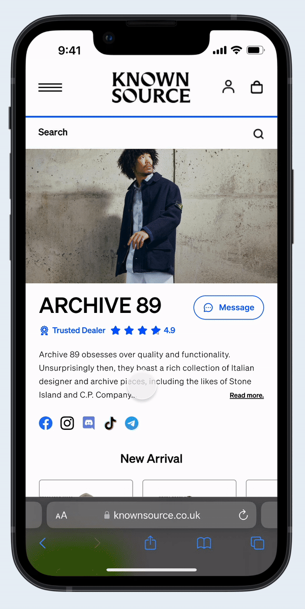
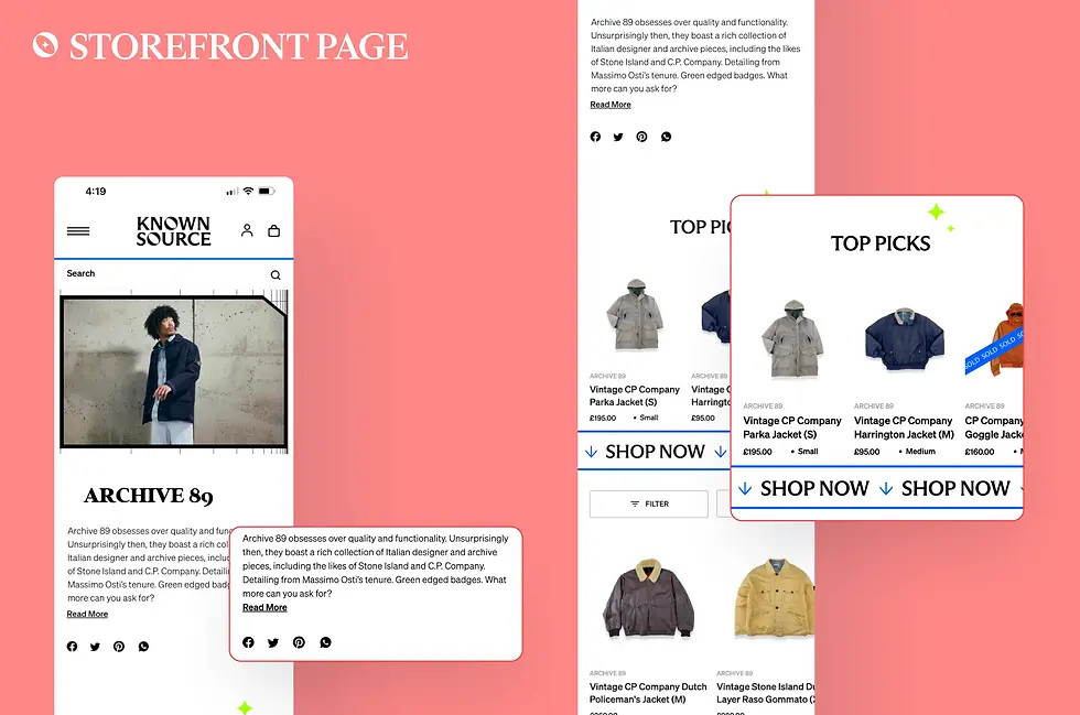
Final Design - Storefront Page
Visualize deeper dealer personality in the first section on the storefront page to help users quickly understand the dealer
Users found it challenging to quickly and easily understand dealers on the storefront page. In response, we extended the data disclosed on this page. We structured the first section to showcase critical information such as reputation ratings, dealer descriptions, and other helpful data. By progressively disclosing this information from the landing page to the storefront page, we help users understand dealers more easily.

Improved Understanding

Users can easily understand dealers through extended and structured information, including reputation ratings and dealer descriptions.
Decision-Making

The progressive disclosure of critical data from the landing page to the storefront page aids users in making informed decisions.
To improve user experience, we streamlined the page by removing unnecessary content, making relevant information more accessible
① We streamlined information to improve readability and information accessibility / ② Tabbed navigation allows users to access information without distractions efficiently

Responsive Web Design - Desktop Version
With Responsive Web Design, users can browse KNOWNSOURCE smoothly and intuitively on different devices
We ensure a consistent user experience across devices, allowing users to browse KNOWNSOURCE seamlessly. The "Dealer Landing Page" presents key information through simple visual elements, helping users connect with dealers efficiently. The "Storefront Page" goes deeper, showcasing dealer personalities in the first section to help users quickly decide whether to engage further. This approach enables users to explore and discover dealers as the mobile version easily.

The desktop version maintains a consistent user experience, reducing the learning curve when users browse the website on different devices

Users can understand dealer personalities and explore items through simple visuals and clear, structured displays
① Users can easily understand the dealer through simple visual elements in the first section / ② Users can explore the dealer's items through clear and structured displays without being distracted by redundant visual design and content

Users can quickly grasp essential dealer information through visual elements and informative design
① Users can get more information relevant to dealers in the first scroll / ② Users can get to know dealers through simple visual presentation
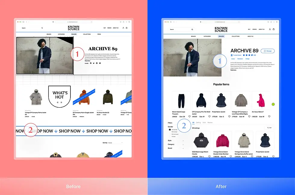
Iteration - Storefront Page
Enhance user understanding of dealer personality with style badges, and 'Popular Items'
Badge designs visually represent dealer styles, allowing consumers to understand each dealer's offerings quickly without extensive reading. Additionally, 'Popular Items' showcases trending and stylish selections, helping customers discover popular products and reflecting the store's unique character.
Iteration
Final Design
Final Design - Dealer Landing Page
Empower users to find their perfect match by showcasing key dealer details, distinct dealer personalities
Users previously struggled to find relevant dealer information, hindering their exploration of new options. To enhance the user experience, we implemented a redesigned dealer landing page that showcases key dealer details and distinct personalities. This approach empowers users to quickly identify suitable dealers, fostering engagement and increasing the likelihood of exploring further options on the platform.

Quick Identification

Users can efficiently discover suitable dealers by clearly presenting essential information and distinctive dealer personalities.
Increased Exploration

The enhanced layout encourages users to explore more dealer options, fostering a more engaging and informative browsing experience.
We also redesigned other elements to boost users' confidence and willingness to connect with dealers
① Users gain confidence in platform reliability / ② Users make informed decisions based on clear data

Iteration - Dealer Landing Page
Improve the shopping experience with clear dealer personalities and favorite buttons
After user testing and stakeholder discussions, we balanced the feedback to iterate the design. Displaying simple data like styles and item numbers helps users understand the first level of dealers. To avoid debate over dealer ratings, we replaced reputation icons with favorite buttons, enhancing the likelihood of users revisiting the platform.
Iteration
Final Design

Design Solution
By providing clear and concise dealer information upfront, we empower users to make informed decisions quickly
Users found the existing page challenging to navigate for relevant dealer information, discouraging them from exploring unfamiliar stores. To address this, we implemented "Progressive Disclosure" on the landing page to present dealer information simply and effectively, allowing users to understand dealers quickly. Additional dealer information is available on the Storefront Page, the next page.
Dealer Description

To help users understand dealers and highlight the unique qualities dealers want to showcase to consumers.
Authentic Badge

To help users recognize that unfamiliar dealers are authenticated, enhancing their positive impression.
Reputation Rating

To help users make confident buying decisions, and see dealers as offering greater value.

#1 Dealer Landing Page
#2 Storefront Page
Testing
Users found dealer descriptions unclear, and stakeholders expressed concern over reputation ratings' impact
User research revealed that dealer descriptions failed to convey personality effectively, with users preferring quick visual cues. Stakeholders were interested in visual reputation indicators but were concerned about potential inequities among dealers on the same page.

Conducting interviews and doing questionnaires

Conducting interviews with stakeholders
Business Goal
Increase user engagement and interactions with dealer storefront pages to drive higher conversion rates
We interviewed stakeholders Theo EI-Kattan and Henry McNeill-Njoku to understand the business goals. They identified that the existing dealer page made it difficult for users to quickly learn about dealers, leading to high user drop-off rates. To address this, they wanted us to revamp the page by effectively conveying dealer personality and encouraging greater user engagement, which can enhance the conversion rate.

Stakeholder Interview
Problem & Insight
Users struggle to quickly connect to dealers due to unclear dealer personality showcasing and an overload of unnecessary details
Through user interviews with 8 participants and a survey with 80 respondents, we discovered that accessing dealer information on KNOWNSOURCE was inefficient and frustrating. The problem hindered users' ability to make well-informed purchase decisions, leading many to leave the platform without obtaining the necessary information.

#1 Dealer Landing Page: Without any dealers information
Causes users to be confused when there are no familiar dealers
#2 Storefront Page: Cluttered text, unnecessary contents
Causes users to feel frustrated to get information
HMW Statement
How might we effectively present dealer information, including reputation and clothing style, to optimize second-hand clothes' discovery and purchasing experience?

01. Dealer Storefront Pages
Dedicated to showcasing dealer personality, style, and inventory while maintaining brand identity